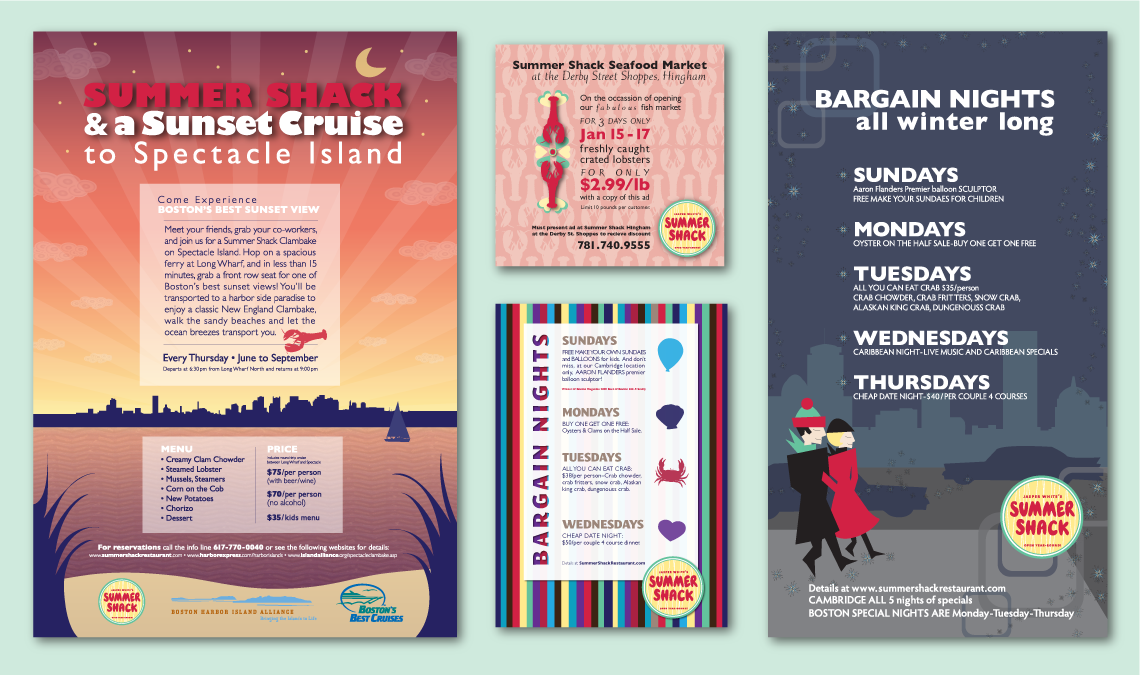
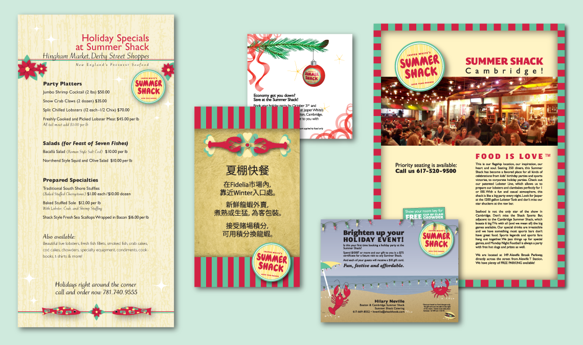
Summer Shack came to us looking for a fresh approach to their promotional materials. They wanted ads that would keep within their fun and “Shacky” image and a look that would make them stand out from the crowd.
We used their existing brand and casual atmosphere as inspiration to produce a series of promotional materials utilizing eye-catching original designs for three restaurant locations (in two languages!) and off-site catering events.
The result:
A series of print and web ads that grab the viewer’s attention with a feel good “mod-retro” appeal.


